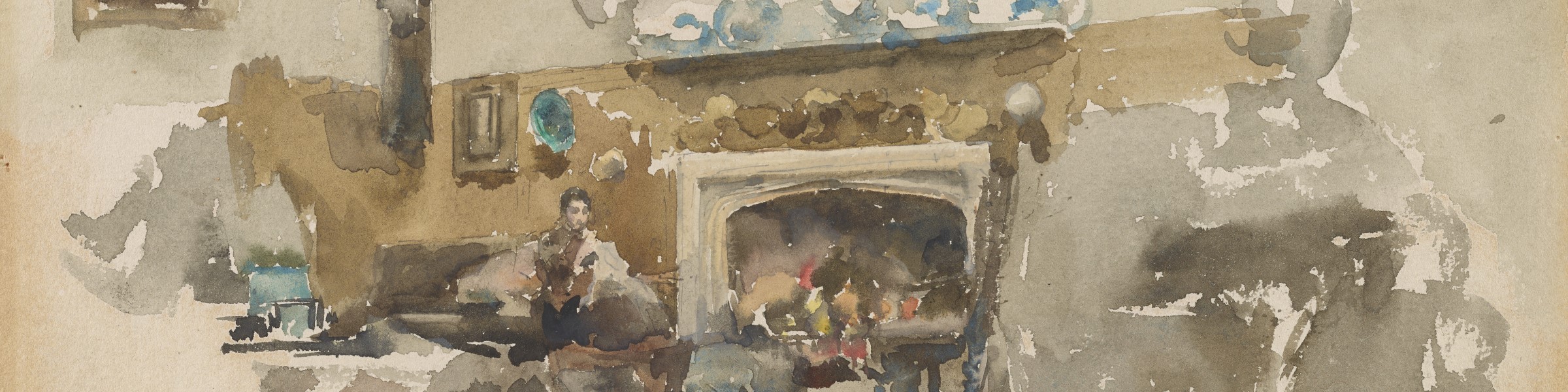
Moreby Hall, by Z. Serena Qiu
In the early 1880s, Whistler was a house guest at Moreby Hall, located south of York in Yorkshire, where he encountered the scene that fills this watercolor. The manor house, built between 1818 and 1831, was then home to Thomas Henry Preston and his wife Georgiana, who might be the figure absorbed in an unseen activity.1 In this small watercolor, Whistler has depicted a sprawling sitting or drawing room with evidence of the residents’ cosmopolitan taste: stuffed furniture and a dimmed rug surround a grand fireplace, above which is a shelf of blue-and-white porcelain and paintings (perhaps landscapes and portraits) in gilded frames. Whistler’s signature butterfly cartouche occupies the unpainted space in the lower left corner.
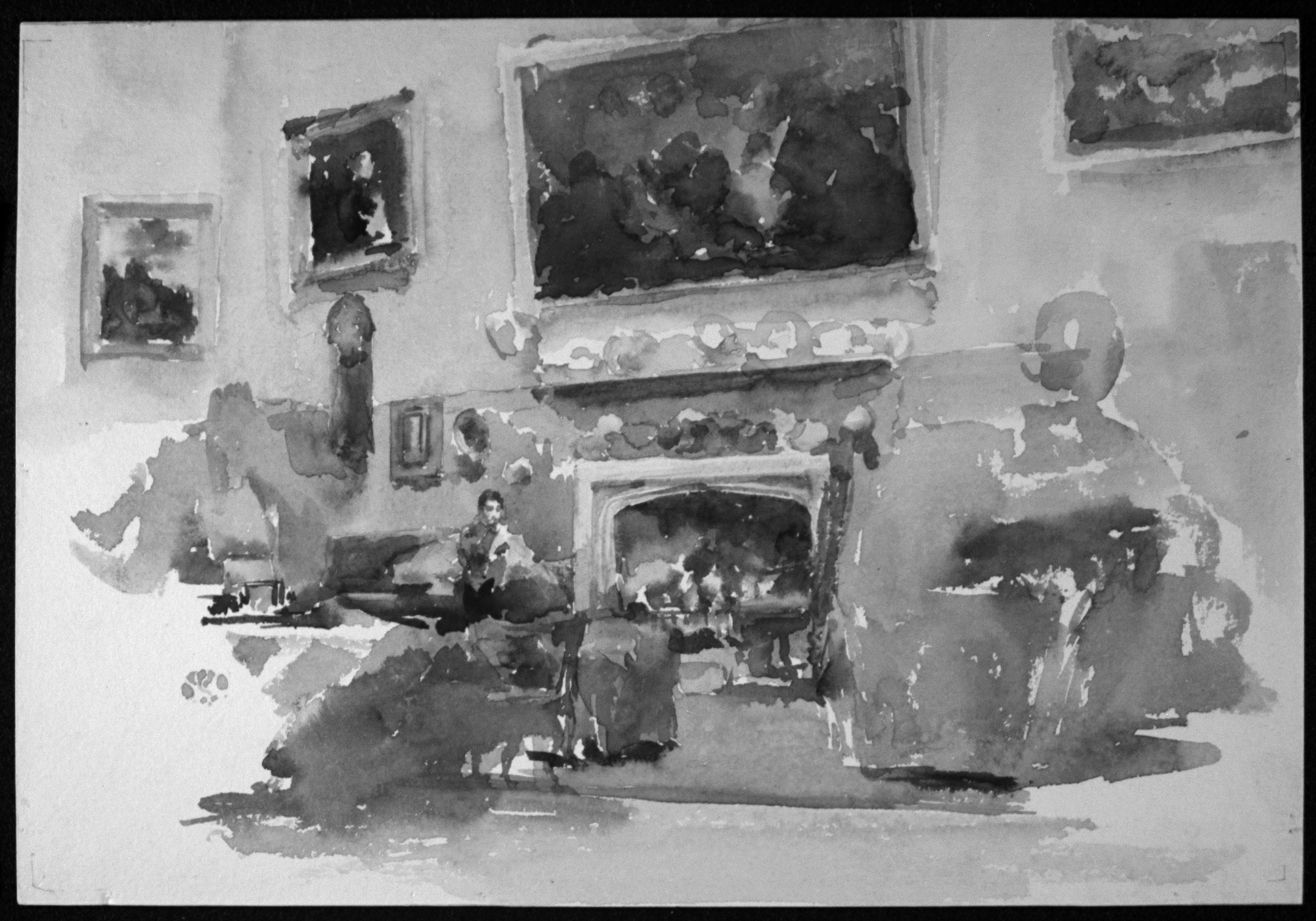
Though the combination of fine “sketch” lines with broadly applied pigments and unpainted areas might suggest Moreby Hall was a spontaneous or rapid creation, spectral analyses of the watercolor help confirm that this scene was a thoughtfully planned composition and a cogently finished piece. For example, the infrared image of Moreby Hall (Fig. 1) does not register the “sketch” lines surrounding the mantle, the sitter, and the hanging objects between them. These marks were not part of a preparatory pencil underdrawing but were instead delicate watercolor pigment, enhancing the image’s rawness or immediacy.2 Indeed, the only pencil marks on this watercolor are the bracket lines found in the corners of the paper, which served as Whistler’s sight marks for framing.
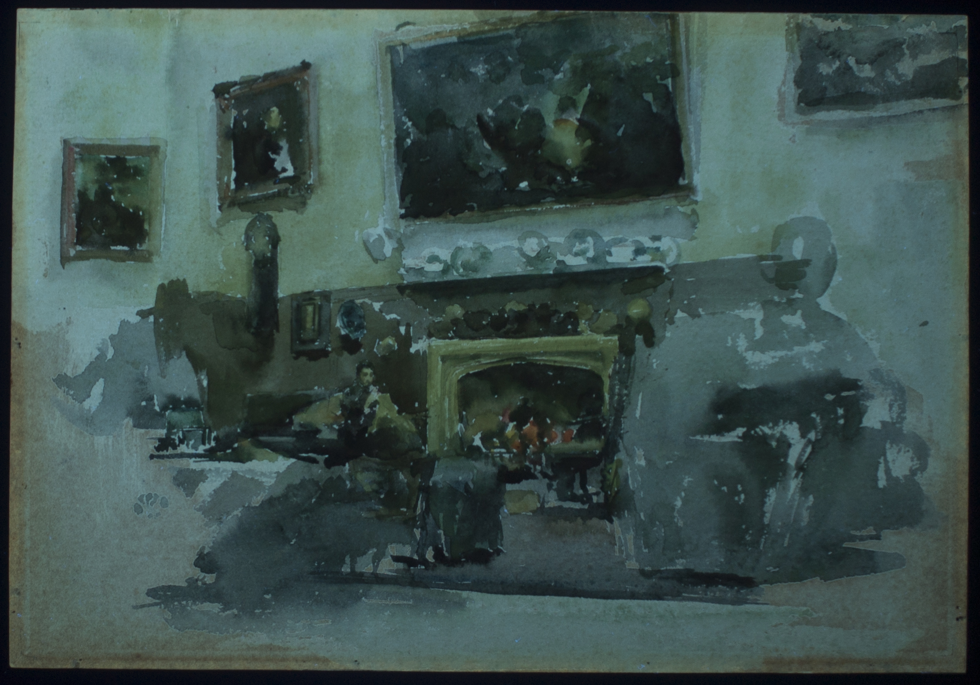
Inspecting the broad fields of pigment in an ultraviolet-induced (UV) visible fluorescence image (Fig. 2) provides further evidence of the precision of Whistler’s handling of both the composition and his medium. A close look above the mantle, where the frame of the largest painting meets the wash describing the wall, shows slivers of unpainted paper, which fluoresce either bright blue in response to exposed gelatin sizing or dark pink where the sizing has deteriorated. That the pigments lay adjacent without overlapping suggests Whistler either anticipated and reserved spaces for the framed paintings when laying down the wash of the wall or that he carefully brought the wash to the edges of the painting.
Considering the watercolor alongside the infrared and UV images suggests the degree to which Whistler anticipated the arrangement of his composition in its near entirety before or during the act of painting, and his careful adjustments along the way. His deployment of both wet-on-wet and dry brush techniques—evidenced respectively in the embers of the hearth and the textured shadows of the sitter’s garments—requires not only deft knowledge of watercolor but also planning and deliberation.
Whistler’s Moreby scene ultimately coheres because of the way he arranged and rearranged the centerpiece of that Victorian room: the shelf of blue and white Chinese or chinoiserie porcelains. These were objects of such central significance to the scene that Whistler moved them around to find a space for their maximum pictorial impact. The shape of the porcelains’ arrangement is mirrored in the disk-like shadows above the fireplace where the mantle would have been, and where hints of circular “sketch” marks are still visible. Their resulting relocation might be the result of Whistler’s recognition that the lighter wash of the surrounding wall would illuminate the blues and whites better than the darker brown of the dado. Furthermore, the blue pigment of the porcelains is deployed throughout the room to add dimension to the shadows of the fireplace and the rug, as well as darken the sky of the central framed painting. The palette of the porcelains thus pulls the room together and forms the visual spine of Whistler’s composition.
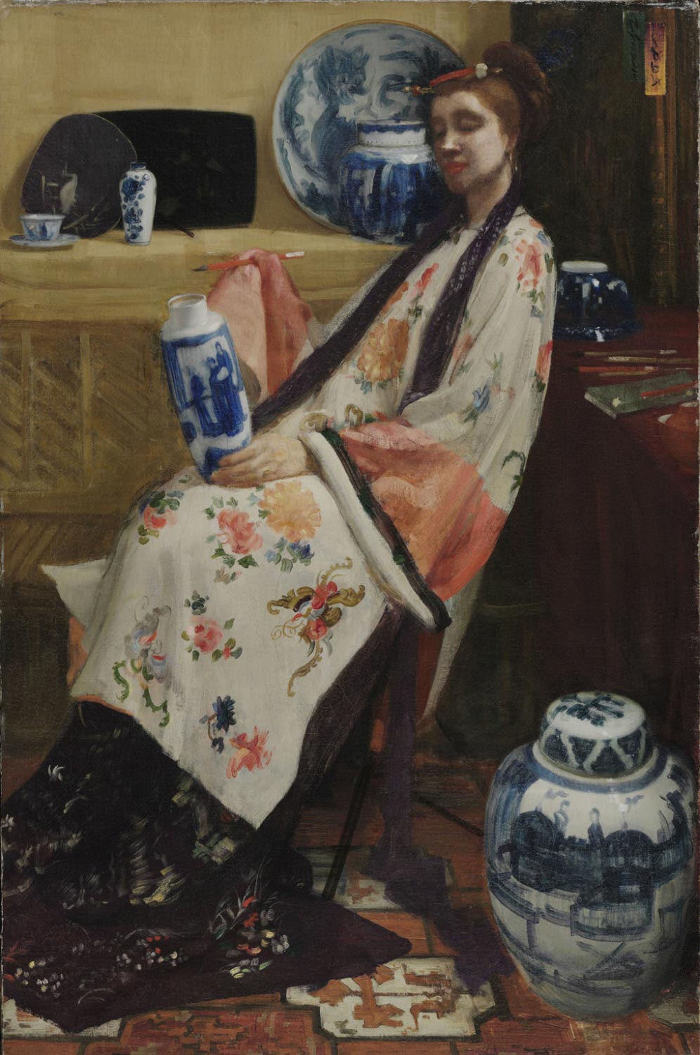
Whistler’s rendering of the blue-and-white porcelains also demonstrates his aesthetic understanding of their function both in his composition and in a Victorian room. Each dish was first painted with a ring of light wash on which he dropped the blue pigment, letting it bloom into the motion of the existing diameter. The result is that the blue-and-white dishes operate as brushmarks in the room—not unlike the way he conceived of activating Frederick Richards Leyland’s collection of Kangxi era vases in the Peacock Room, or the translation of cobalt blue underglaze to gestural ink drawings of Sir Henry Thompson’s collection [F1898.415], or in the analogization of his aesthetic project with that of painting porcelain in Purple and Rose–The Lange Leizen of the Six Marks (fig. 3).3 In Moreby Hall, they crown and center our vision of a lushly decorated and intimate space.
Bibliography
1 David Park Curry, James McNeill Whistler at the Freer Gallery of Art (Washington, DC: Freer Gallery of Art, Smithsonian Institution, 1984), 199.
2 Margaret F. MacDonald, James McNeill Whistler: Drawings, Pastels, and Watercolours, A Catalogue Raisonné (New Haven and London: Yale University Press, 1995), 345.
3 Sir Henry Thompson, A Catalogue of Blue and White Nankin Porcelain, Forming the Collection of Sir Henry Thompson, illustrated by the autotype process from drawings of James Whistler (London: Ellis and White, 1878).