Nocturne: Grey and Gold–Canal, Holland, by Erin R. Corrales-Diaz
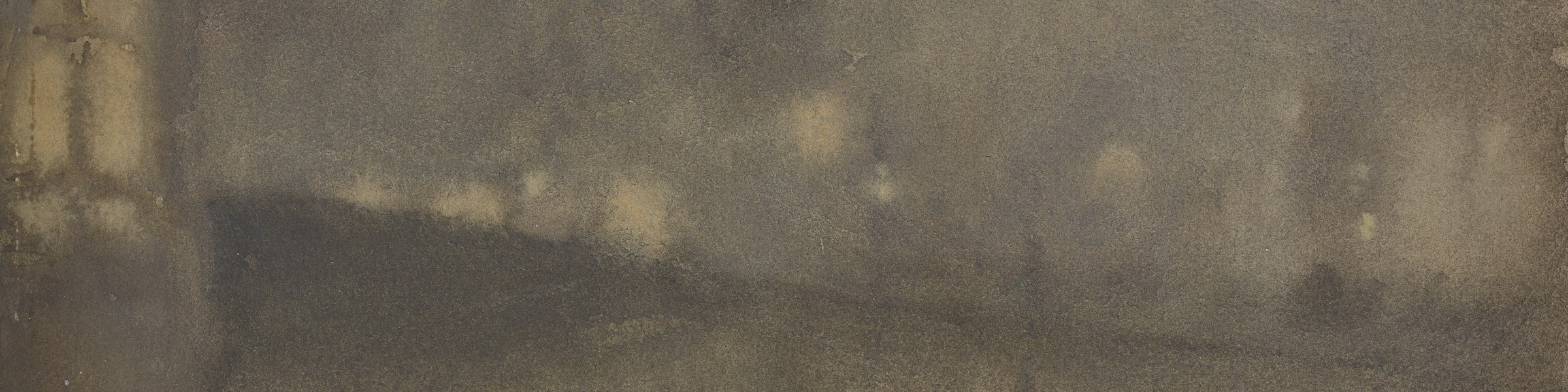
Nocturne: Grey and Gold—Canal, Holland evokes the shroud of darkness along an Amsterdam riverbank. The vertical format of Canal, Holland with its high horizon line alludes to the climbing composition in Japanese ukiyo-e prints. A thin, sloping line of opaque, ashen gray suggests a bridge, while a few vertical lines and patches of heavily applied dark paint allude to lampposts and human activity. Above the bridge, Whistler applied paint with a wet-on-wet technique, allowing the color to flow unencumbered into feathered blooms. Lights from streetlamps and sparkling stars breach the hazy concoction of polluted vapors and clouds. Below the horizon, glimmering streaks of light reflect in the canal’s waters. Heavily saturated and overlaid washes of ivory black, zinc white, and cadmium yellow nearly eradicate the surface of the cold-pressed paper. Whistler blotted and perhaps even sanded the layers of washed paint—his “sauce”—to create an even chromatic unity of sky and water. In the lower left corner, two pools of light gray bleed into tendril wisps, forming two spectral figures. Without his signature butterfly in the lower right, the painting’s orientation could almost be reversed due to the mirrored symmetry and uniform palette.
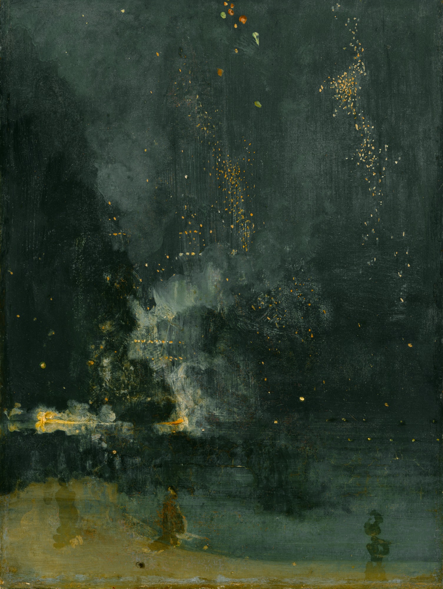
Often considered the most experimental and extreme of his watercolors, Whistler’s nocturnes, including Canal, Holland, demonstrated his mastery over the demanding medium. In fact, Whistler’s embrace of watercolor was the result of a nocturne. Following his costly 1877 libel suit against John Ruskin’s critical review of his oil painting, Nocturne in Black and Gold–Falling Rocket (Fig. 1), Whistler sought to revitalize his career. He embraced a medium in which he had only dabbled prior to the trial—watercolor. Despite his limited financial means, Whistler traveled in the wake of the trial, first to Venice in 1879, and then to Amsterdam in 1882, producing “little games,” the artist’s term for his small, marketable watercolors.1 The Netherlands inspired Whistler to revisit his infamous nighttime impressions in watercolor. He wrote to his friend Thomas Waldo Story about the differences between the two cities and how the new sites invigorated the artist toward painting “Nocturnes—and various!”2 During the daylight hours, Whistler captured quaint vignettes of Dutch life in etchings. In the evening, he drew his sights toward imagined illicit activities made possible due to the heavy veil of night. In Canal, Holland, Whistler did not give light to these nocturnal trysts and clandestine encounters but instead made “darkness visible.”3
According to one disgruntled critic, “pictures in darkness are contradictions in terms.”5 To make the depths of night perceptible requires the artist to paint without light.5 Whistler grants the viewer a sight of amorphous forms recalling built structures and the natural environment while simultaneously concealing specificity and, thus, rejecting traditional parameters of vision. In fact, Whistler obscures so many of the landscape features that the particular locales in his Amsterdam nocturnes elude geographical attribution beyond mere generalization. This is in stark contrast to his earlier London nocturnes where landmarks or features are identifiable. The point, of course, was not to paint a portrait of a specific place but to present “an arrangement of line, form, and colour first.”6
In a play of reflected and transmitted light, Whistler painted a smoke-and-mirrors illusion. Through a twist of technical misdirection, he transformed watercolors into oils and vice versa. Testing the limits of the medium, Whistler explored new methods for painting nocturnes. His “sauce” for his oil paints was a mixture of tubed pigment with linseed oil. He could apply this thin, fluid paint to his canvases in transparent layers like a watercolor. Similarly, the visible paper fibers in Canal, Holland suggest he handled his watercolors with a vigorous application and aggressive reworking more attuned to oils. A former pupil, Mortimer Menpes, observed another connection between the nocturne oils and watercolors: “In his watercolors Whistler always used Chinese white with every tone, to give the body pigment—just as in his oil colours he used ivory black.”7 Concerned with tonal cohesion and chromatic unity, Whistler often applied ivory black as a “universal harmonizer.”8 But for his watercolors, Whistler turned to zinc white in addition to ivory black, which under UV light is evident throughout Canal, Holland—an observation invisible to the naked eye. Indeed, to see in the darkness requires a distinct mode of visual sensitivity, whether it is high-tech scotopic devices or prolonged attention from the viewer to adjust to low-light conditions. In his nocturnes, Whistler strove to go beyond “relation whatever to life” and seek out the murky limits of human perception—to see in total darkness.9
Bibliography
1 See Lee Glazer, et al., Whistler in Watercolor: Lovely Little Games (Washington, DC: Freer Gallery of Art, Smithsonian Institution, 2019).
2 Whistler to Thomas Waldo Story, dated December 1882, The Correspondence of James McNeill Whistler, 1855–1903, edited by Margaret F. MacDonald, Patricia de Montfort, and Nigel Thorp; including The Correspondence of Anna McNeill Whistler, 1855–1880, edited by Georgia Toutziari.
3 John Milton, Paradise Lost, 1667, I.63.
4 “The Academy and the Grosvenor,” The Literary World 25, no. 657 (June 2, 1882), 345. Whistler reprinted this comment in his revised 1892 autobiography, The Gentle Art of Making Enemies.
5 In thinking about nocturnes, darkness, and night, I found Hélène Valance to be a valuable resource. See Nocturne: Night in American Art, 1890–1917 (New Haven: Yale University Press, 2015).
6 Richard Dorment and Margaret F. MacDonald, James McNeill Whistler (London: Tate Gallery, 1994), 122.
7 Mortimer Menpes, Whistler as I Knew Him (New York: Macmillan, 1904), 73.
8 Christian Brinton, “Whistler from Within,” Munsey’s Magazine 36 (1907), 19.
9 Henry James, “The Picture Season in London,” Galaxy 2 (August 1877), 56.